He occasionally blogs about software design, continuous integration and game development with Godot Engine.
Game design: one finger to rule them all
Everyone owns a smartphone nowadays. People are swiping within their apps up and down, left and right, panning in and double tap whenever they get the opportunity. What people definitely don’t want is having to use more than a single finger. When looking at popular apps like Instagram, Twitter or Boost, the entire UX flow is designed for single-hand use. Game developers such as King have taken that principle to another level for a simple reason: Accessibility.
If you want your game to be played by the masses, it needs to be accessible. In order for a game to be accessible, it needs to be supported by the hardware and the user should not get confused how to actually play the game. Many mobile games have long and annoying tutorials, explaining the complex UI and input methods such as buttons and virtual HUDs. Personally, I always disliked the fact that controls are being emulated on smartphones via HUDs like this:

Especially on a busy train or a cigarette in one hand, playing those kind of games can be quite tricky. Why don’t all mobile games just have simple One Finger to Rule them All controls?
Simple controls are challenging
There is a simple reason why so many games try to avoid simple input but instead use more complex input mechanisms: it can become rather complicated to communicate how the game can be played, when there is just a single input method! On the other hand, as a user I do not want to read through manuals or tutorials to learn how to actually play the game. Time is much better spent and there are so many games out there which do not require any tutorials whatsoever. Thus, designing a simple input system which can be just with just one finger is key. Before we can implement simple input, the following questions need to be answered:
- how does the player know if he should swipe, pan or where to click?
- how do I prevent that the player accidentally uses wrong controls?
- how can I ensure the player learns the controls naturally by just trying out?
Answering these questions gave me confidence to build all my games with simple controls. This made designing UI components rather hard but eventually paid of by having a really simple game experience.
The more limited the controls are, the more accessible the game is. However, the amount of input combinations decreases with limited controls.
Finding the perfect balance between those two is the real challenge.
A first approach
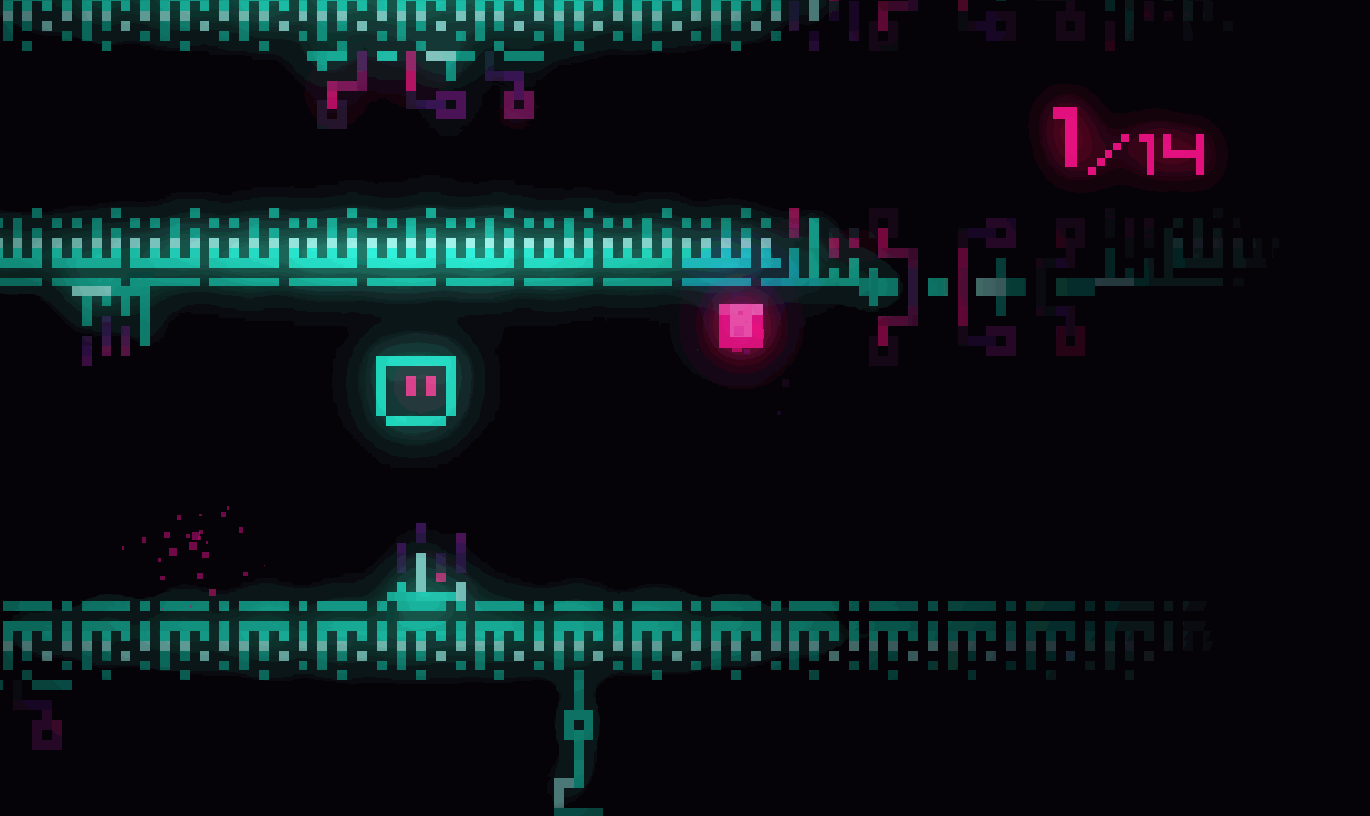
Currently I am working on a small game called scape - it is a fast-paced 2D platformer written in Java, using my gamejam framework called braingdx. You play a little virus infecting a compuer system. I got inspired by Yoo Ninja!, one of my favourite Android games:

Basically, the idea is to reach the end of the level without falling out of bounds. Touch the screen to jump (and effectively flip gravity). This is how my game scape loks like:
The first thing the player does is touching the screen and one notices that the character will jump as a consequence. However, this has some impact on the initial game design:
- the player should not be punished for not touching the screen initially
- the player should notice that he needs to do something in order to progress
- the player should also learn in the beginning what the consequences are if no action is taken
To solve all these questions I did a simple trick: I placed a block in front of the player. As a result the player bumps into the block at some point, gets stuck and the moving camera will kill the player if out of bounds:
The player has no other choice than trying to touch the screen. Each level has been designed so the player automatically initiates actions to play the game, without having an explicit tutorial:
As a game designer, this is not obvious at first. Only after a couple of iterations I can eventually refine the level structure to ensure the best possible game experience.
The dark side of the moon
Having a character jump via touch is not the most difficult mechanic. The One Touch Mechanic made things especially more tricky when it came to menu flow:
- how do I communicate to the player that he has to swipe in order to switch to the next level in the stage selection?
- how does a player know he needs to touch the screen to enter a level?
- how does a player know he requires to keep the screen touched to skip a cutscene?
Those questions are just partially answered and I am currently about to rewrite the entire menu flow to improve on that drastically.
Into the Future
Currently I am refining the level design, updating assets and rewriting the level selection flow. In another blog article I am going to elaborate on that more detailed. Stay tuned!